The ideas here are inspired by Joshua Batson’s, “How to see a meromorphic one-form.”
- Introduction
- First idea: pushing forward
- Better idea: pulling back
- What can we do?
- Sample code
- Last thoughts
Introduction
Visualizing functions is hard work, especially when their source and target are not intervals in 


For example, given 


ComplexPlot3D[(z^2 + 1)/(z^2 - 1), {z, -2 - 2 I, 2 + 2 I}]We can learn a lot from this picture—for example, we can see the roots (where the colors all come together) and poles (where the surface blasts off to infinity) of this function easily. We can put together more by swiveling the plot around, but we quickly run into lots of the well-documented problems regarding how humans make sense of area and perspective. By the way, be wary of pie charts—especially the 3D kind.

ComplexPlot3D[(-z^20 + 228 z^15 - 494 z^10 - 228 z^5 -
1)^3/(1728 z^5 (z^10 + 11 z^5 - 1)^5), {z, -3 - 3 I, 3 + 3 I}]
Above is a plot of Klein’s icosahedral function 
While there are many other techniques for drawing functions of complex variables or maps between Euclidean spaces, I have seen very little on the really wonderful technique that Joshua describes in his paper. Domain coloring is the closest to what we will discuss here, which is very close to Mathematica’s ComplexPlot, but I think these still miss the mark when applied naively.
First idea: pushing forward
Functions are assignments—they go somewhere, sending points from a source to a target. So, when incorporating color into pictures of functions, it is natural to first think of pushing colors or other data along the function. This is a fantastic idea, but unfortunately it doesn’t work most of the time for visualizations. Let’s think about why with a quick aside (which can be easily skipped—in fact, this whole section can be bypassed if you want to just see cool math pictures already).
Pushing forward information is a great idea locally. This is a crucial idea in differential geometry. If we have a map, say 


This process is linear and defines a transformation 


evaluated at

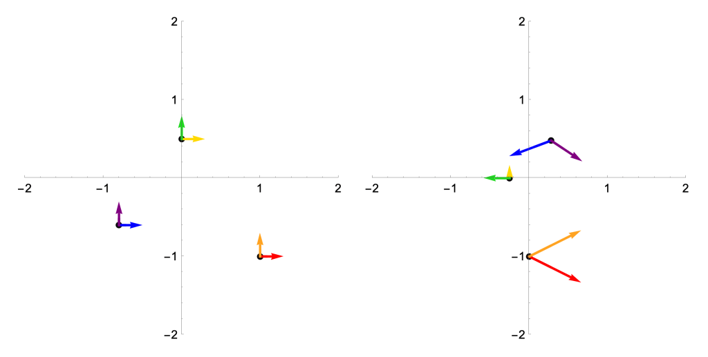
While the picture on the left requires a nontrivial bit of computational power to render—those distortions are non-linear, so drawing the gridlines in the target take some work—we could sketch the one on the right with some pen and paper (and maybe a calculator, since I didn’t pick integer coordinates). That’s the power of calculus! For one last little treat, the determinant of the Jacobian at each of these points (which is zero if and only if the Jacobian is one-to-one, because linear algebra rules) tells us how area is being distorted by 

In words: the columns of the Jacobian matrix at
Anyways, back to visualization. We might think “let’s use color to see what
- Not all functions are injective. If
are distinct points with
, then should we color
?
- Not all functions are surjective. If
is not in the image of
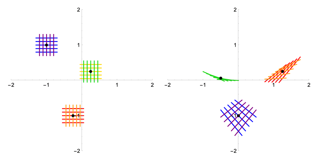
These are actually the same reasons why, while we can always push tangent vectors forward along differentiable maps as above, we cannot in general hope to push forward whole vector fields. The local does not always glue together into the global!

What a mess!
Better idea: pulling back
If we think carefully about what functions are, we realize that the previous idea has things backwards. It’s true, a map 


For example, under the complex-valued function 


So we propose the following idea. Instead of coloring the source and trying to push colors along our functions, we color the target and pull back colors along fibers. This is best understood with some pictures which, after all, is the point:

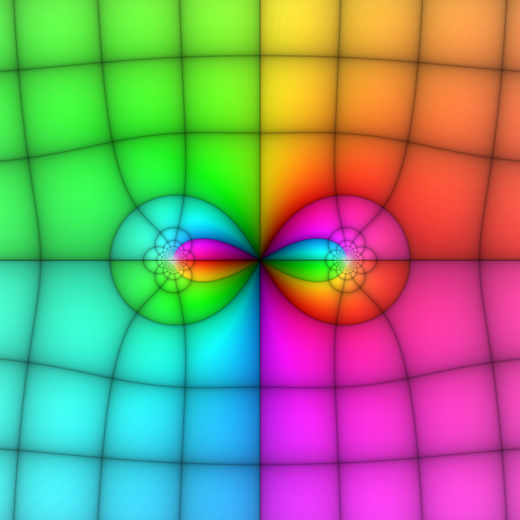
Okay, fine, this isn’t the most illuminating example because it doesn’t look like anything is going on. But this is a picture of the function 


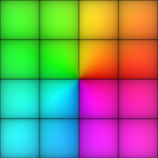
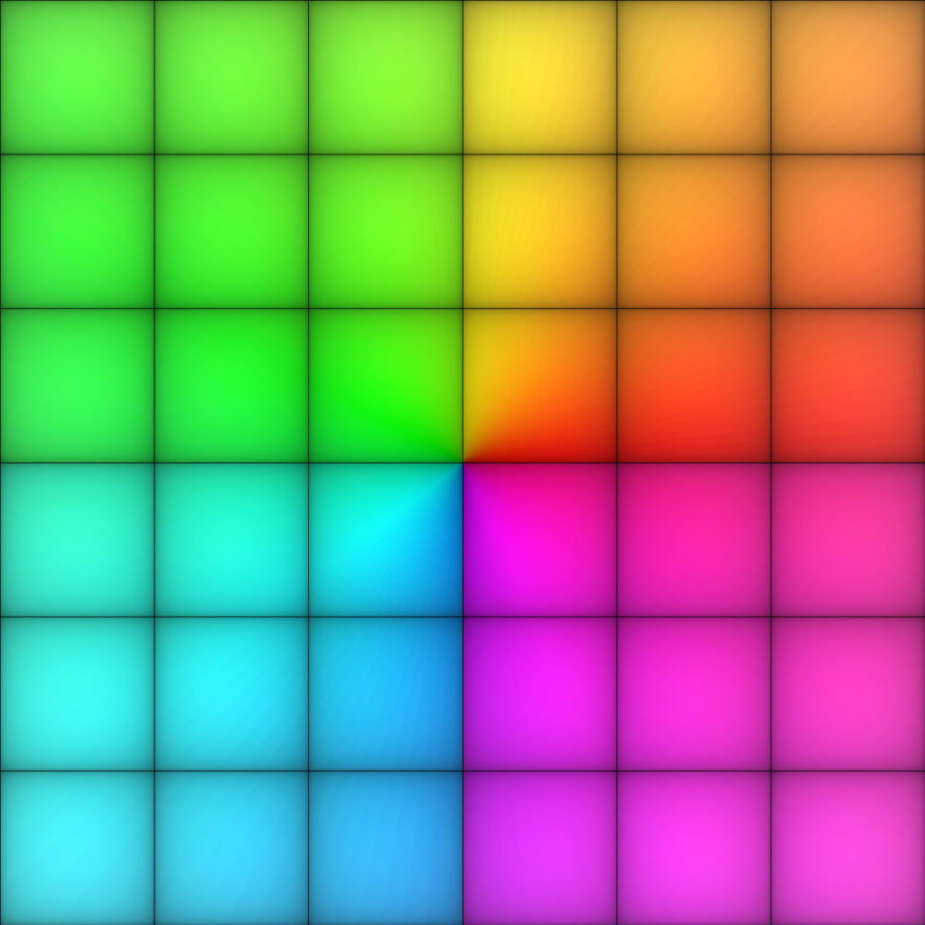
To keep things simple, I didn’t change the coloring of the target—more on that later. But, for now, big things have happened! Let’s look at some examples by listing some easy values of this function: 


My main self-criticism with this method is that it’s hard to tell exactly where points are in the source, since we don’t label them. An easy modification would be to reserve some sort of color not used in the image, maybe a nice medium gray, to print and label a grid on the source. But I’m here for the aesthetics, so figure that out on your own! I’ll always plot the source and target using the same viewing window, so use that to gauge where things are for the time being. Okay, let’s try another polynomial function: 

Once again, we can see the roots of this function easily. More than that, and I invite the curious reader to reflect on why this is so—we can also see the multiplicities of the roots. In particular, the source coloring near 

I love these diagrams so much. You can see that if we zoomed in very close on those two nearby roots, they also would look (locally) like the target coloring at 
What can we do?
Here is where the pics get good
Taking stock, you might be unimpressed by all this. With the target coloring I introduced, we can easily recognize roots (and their multiplicities) for polynomial functions 
ComplexPlot3D (or just ComplexPlot, which look even more like what I’m producing above) in Mathematica, we realize that existing tools already accomplish that without all this work.
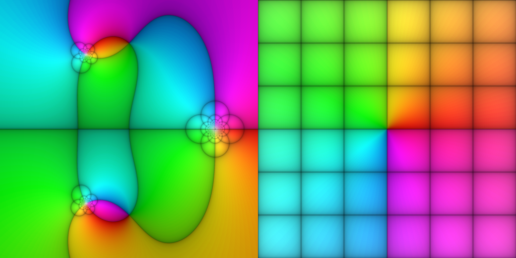
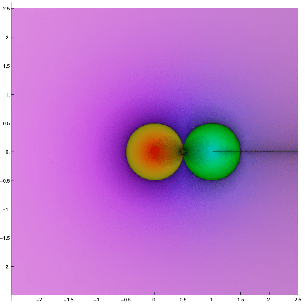
But we’re just getting started! First, let’s talk poles—a crucial feature of functions in complex analysis—which are hard to analyze in ComplexPlot3D because of how they zoom off the plot window. Let’s look at a few functions, with the same coloring as before, and see what’s what. Note that I’m printing all of these sources in the window from 


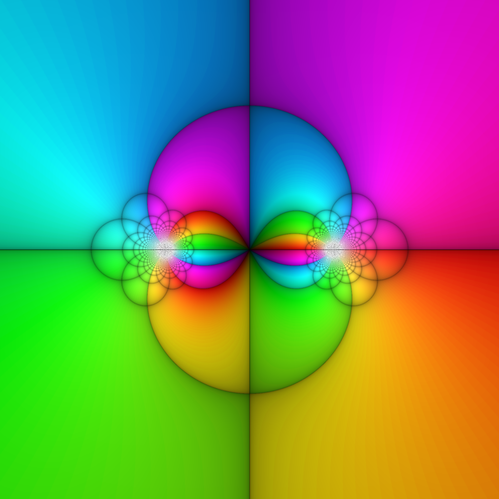
Can you distinguishing the double root from the isolated root in the first image, or see the poles at 


A quick note on this case of meromorphic functions—though, as we’ll see, many more things can be drawn with this method. As Joshua points out on page 4, due to the oft-celebrated fact that holomorphic functions are conformal (away from where their derivatives vanish), we need not plot both horizontal and vertical lines in the coordinate grid. My contribution to mathematical illustration is to say: “We need not, but we should!” Consider the following picture-proof:

Every once and a while, I need to sit with myself and reflect on how truly bonkers it is that we can have so much non-linearity and still preserve angles. Let’s lean into that! These pictures really illustrate a fundamental idea in complex analysis:
- Away from ramification points (where
), holomorphic functions can stretch, dilate, and rotate, but always conformally.
- Near ramification points, holomorphic functions look like
for some
.
- Near poles, meromorphic functions look like
for some
.
Now, I’m promising that our generalized perspective will grant us more. It’s time for the payoff. Until this point, we’ve used a coloring scheme on the target which allows us to easily see roots and poles of complex functions—when they take the value 
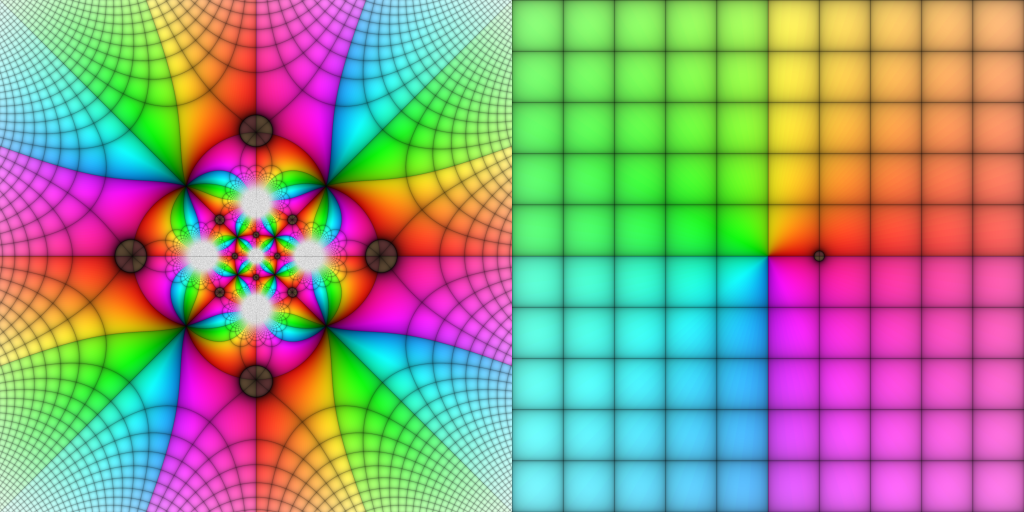
Klein’s icosahedral function
In a series of lectures published in 1888, Felix Klein outlined how one may use the symmetries of the icosahedron (that’s right, you nerds, a d20) to solve quintic polynomials. In particular, he used that the alternating group 


All told, we have a rational complex function
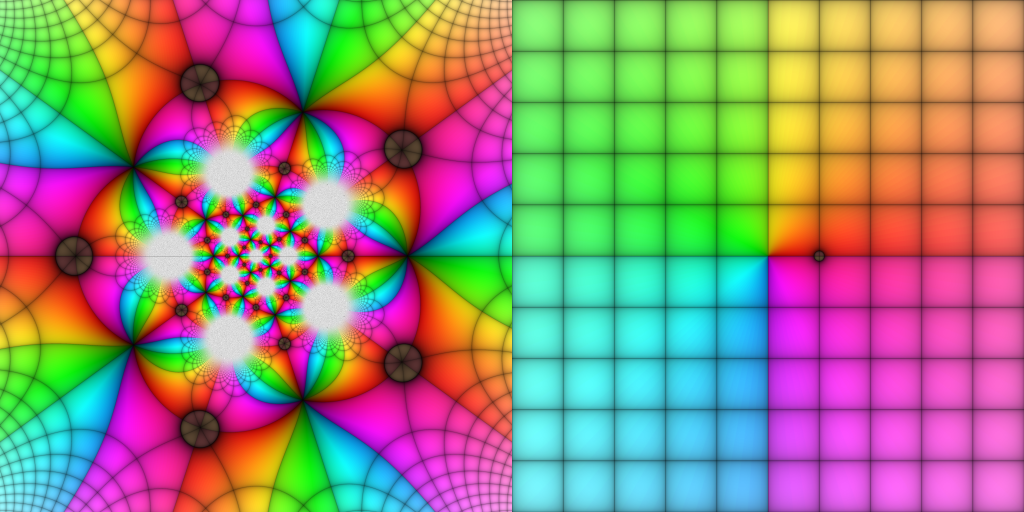
Remember that this whole story is really describing a branched covering of the sphere over itself, i.e., an 
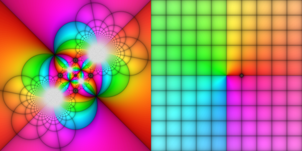
Monodromy of algebraic functions
Oh but there are more colorings we might think about that can show us information about algebraic functions! In particular, these functions enjoy a beautiful property called monodromy that, among other things, obstruct how they can relate to one another and served as one of the fundamental phenomena that gave rise to algebraic topology. While it goes beyond the scope of this post to give a general framework for what’s going on, the fundamental idea is we want to understand how values of an algebraic function might vary as we traverse loops—taking square roots is a classic example, where we have to use branch cuts in complex analysis class in order to talk about √ as a well-defined function.
With the example of the icosahedral function, we want to understand what happens to loops about its branch points. In particular, we want to draw a little loop around 


The first thing to notice is that the picture of the target is totally different. My goal is to understand these loops, not to otherwise keep track of the values of this function, and the coloring reflects that. Herein lies the real power of the pullback visualization technique: we can do whatever we want! For the experts, we can see that the loop about
Sample code
Here is a short bit of Python code for visualizing functions of a complex variable as described here. Note that the sample function 
** instead of the ^ operator for exponentiation.
from PIL import Image
from math import atan2, pi, exp, sin

# the desired function
f = lambda z: (z**2+1)/(z**3-1)

# set the viewing window and image size
(xMin,xMax) = (-2.5,2.5)
(yMin,yMax) = (-2.5,2.5)
dim = 480

# use to avoid 1/0 if f is rational
epsilon = 0.000001

# sample coloring procedure--experiment with your own!
def color_point(z):
	(x,y) = (z.real,z.imag)
	(r,theta) = (abs(z),atan2(y,x))

	# color by quadrant using -pi < theta <= pi
	if theta<-pi/2:
		h = (2*theta/pi+2)/8+0.45
	elif theta<0:
		h = (2*theta/pi+1)/8+0.8
	elif theta<pi/2:
		h = (2*theta/pi)/6
	else:
		h = (2*theta/pi-1)/8+0.25

	# have saturation taper off to infinity
    # draw a grid along the integer lattice
    # and scale everything into the 0-255 range
	h = int(255*h)
	s = int(255*exp(-r/10))
	v = int(255*pow(abs(sin(pi*x)*sin(pi*y)),0.12))

    # return as hue-saturation-value, will convert later
	return (h,s,v)

pullback = Image.new('HSV',(2*dim,dim),'black')
pixels = pullback.load()

# walk through each pixel in the image
for i in range(dim):
	for j in range(dim):
		x = i * (xMax-xMin)/dim + xMin
		y = ( dim-j ) * (yMax-yMin)/dim + yMin

        # draw the source/target pixels simultaneously
		pixels[i,j]=color_point(f(complex(x,y)+epsilon))
		pixels[dim+i,j]=color_point(complex(x,y))

pullback = pullback.convert('RGBA')
pullback.save('output.png')
Now go have fun visualizing your favorite functions!
Last thoughts
I love how this technique vividly demonstrates the categorical process of pulling back (as in differential geometry, algebraic geometry, cohomology, etc). Given a function 


Here is a picture of Klein’s icosahedral function with a new coloring scheme on the target, but this time I’m embracing the fact that this function is a branched cover between spheres (which really allows the icosahedral inspiration to shine).


We conclude with (a movie of) a map 


- For the experts, this is a projectivization of a 2-dimensional irreducible representation of
, the Schur cover of
